In September 2016 LinkedIn announced, on their official blog, their new design changes for the desktop.
My LinkedIn profile has already updated and here are my initial thoughts.
The Home Page
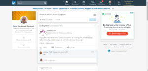
As you can see the home page is much cleaner.
In the top left you can see a snapshot of your profile with your picture and headline, along with the number of people who have viewed your profile and recent articles. You can click on your profile picture to start editing and to view your recent activity. Your newsfeed is in the centre and advertisements are on the right.
There is a slight difference in the content sharing section (just above your newsfeed). You can now share an article, update or photo and your updates can be shared publicly (to anyone on Twitter), straight to your connected Twitter account or only to your connections on LinkedIn. Fear not though, you can still @mention other users and include links! Below this is the link to create your next fabulous article, which is done exactly the same as before.
You’ll also notice that the menu bar has also changed:
The profile section is now called ‘Me’
Click on ‘me’ to view and edit your profile, access the help center, adjust privacy & settings, manage your account (upgrade or downgrade), change language, manage your account , manage job postings, manage a company page (if you are a company page administrator) or sign out. Now when you are editing your profile, the prompts for new sections are top right.
There are three areas for updates – backgrounds, skills and accomplishments.
Background includes work experience, education and volunteer experience.
Skills is just what it says on the tin.
Accomplishments includes projects, courses, publications, certifications, honors and awards and patents.
Note: When updating your profile the reminder for whether or not your network will receive notifications of your changes is within each section as you update. Look out for this and if you are in any doubt, make sure you take a visit to the privacy & settings section and check the settings for ‘sharing profile edits’ before you begin your changes. Which leads us nicely on to a change within those Privacy & Settings.
Privacy & Settings (which can be found under your new ‘me’ menu)
The following options have recently been added to the communication settings. The ‘messages’ from members information was previously under the heading ‘which communications you’re interested in’ and includes introductions and InMails.
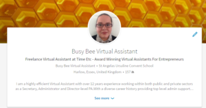
Your profile
Only the first two lines of your summary section are visible to viewers , so these need to be good.
Your contact and personal information now appears top right.
Skills & Endorsements
The design for this has changed (was that a big cheer?). The top three skills are now ‘featured’.
A LinkedIn news release in October 2016 says: “We’ve made endorsements smarter by highlighting endorsements that matter most to the viewer so you always look your best. For example, viewers will see endorsements made by mutual connections, colleagues, and people who are knowledgeable about the skill, which could give you the edge you need for your next job opportunity. We’ve improved targeting to suggest endorsements to connections that know the skills and your work best. This means the right connections are much more likely to validate you for the skills that you want to be recognized for. Tip: check that your skills are listed in order of the strengths you want to highlight and we’ll do the rest by targeting suggestions for those top skills. Now, when someone views your profile, they’ll only see the most relevant endorsements for the skills you want to highlight.”
Search
This is the BIG change! The new user interface has a single search box with no drop downs or ‘Advanced’ option on the menu bar. However, if you click into the search box and just click on the magnifying glass you do get the option for more detailed searching where you can then search by people, jobs, companies, groups and schools (as before).
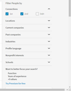
Down the right hand side you will also find the filters for levels of connections (first, second, third), current companies, past companies, industries, profile language, non-profit interests and schools.
For the additional features you’ll need to upgrade. There’s different account types, which I’ve put some information about at the end.
A big plus for me is that when you click on the ‘connect’ button in a search result you now get a clearer reminder to personalise the invitation. This now appears wherever you click on the connect button
My network
This section clearly shows your invitations and people you may know. You can accept, connect, message or remove connections from this page.
The prompts to import your address book have not disappeared either. LinkedIn is still prompting that “The fastest way to grow your network is to import your contacts”. Personally I haven’t done this and have no intentions of doing so either but that’s your preference.
Messages
Apart from design, the messaging section doesn’t appear to have changed.
Notifications
Notifications is now on your new look menu bar, replacing the flag icon. You can view people in your network who have published an article, see peoples birthdays, promotions, work anniversaries etc. You will also see people who have followed you, endorsed you and engaged with your articles and/or other content.
All the updates are now in one place which makes it a lot easier and tidier and also makes it the second place to go after viewing your homepage newsfeed. …. it’s the place to be social.
The ‘More’ Tab
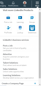
Links to post a job, groups, ProFinder (not yet available in the UK), Lookup and Slideshare are also grouped under the ‘More’ tab. You can also access LinkedIn’s business services (you need to click on ‘show more’) including advertising, talent solutions, sales solutions and learning solutions. If you need to create a Company Page, here’s where you need to go.
Groups
Now under the ‘More’ tab, groups and their functionality do not appear to have changed. (In fact, within the groups section the navigation has reverted back to the old design). However, groups don’t seem to appear to visitors to your profile. They can no longer be used to demonstrate your interests, and it’s no longer possible to research what groups your customers and prospects are using… the only search option is within the group itself.
LinkedIn Learning
LinkedIn Learning was launched in September 2016, following the acquisition of Lynda.com in April 2015. The news release said: “Today, we are thrilled to announce the launch of LinkedIn Learning, an online learning platform enabling individuals and organizations to achieve their objectives and aspirations. Our goal is to help people discover and develop the skills they need through a personalized, data-driven learning experience. LinkedIn Learning combines the industry-leading content from Lynda.com with LinkedIn’s professional data and network.”
The features we have lost
You can no longer change the order of sections on your profile
I used to find this quite useful, particularly if there was a project or new publication to highlight.
Saved searches
No longer available on a free account. So if you use LinkedIn for Lead Generation, it may be a good reason to upgrade to a premium account.
Notes and Tagging
The feature to add notes and tag contacts with information has been removed.
Export connections
There’s no instant download option for exporting connections, you will need to visit privacy & settings to request ‘an archive of your data’.
Recent Updates / Top Updates
There is no longer the ability to change the newsfeed order. Again, I used to find this quite useful but it’s not the end of the world.
Profile View Metrics and How You Rank
The new home page shows the number of profile views. When you click on this (to see who your viewers are), you can see the time period for this (usually 90 days) and the percentage improvement on the previous week. There is no graph to check week-by-week and no indicator of your activity that contributed to the result.
The How You Rank feature which showed metrics based on your profile views among your connections, your company, and professionals like you has been removed.
Due to these changes the only stats you can now access are via the Social Selling Dashboard (and you need to know the link): https://www.linkedin.com/sales/ssi
I’ve also noticed that when you now look at who has viewed your profile, there is no prompt to ‘message’ or ‘connect’. You will need to click through to a profile, and action from there. This may help to reduce the number of random connection requests.
Upgrading options
You can find more information here: https://www.linkedin.com/premium/products?upsellOrderOrigin=premium_nav_upsell_text
I occasionally upgrade my account for a month for the additional search criteria then I cancel.
I would suggest setting your objectives and work out what LinkedIn can do for you and your business. If you’re hitting barriers with a free account, then take a free trial of a premium account and evaluate the benefits.


